Showing posts with label Honours Project. Show all posts
Showing posts with label Honours Project. Show all posts
Friday, 11 May 2012
Sunday, 6 May 2012
Final Project - Once Titles
This is the final product of my honours project. You can view the animations here under the public upload (which have replacement audio because the original is copyrighted) or follow this QR code if you have a smartphone or contact me if you would like to view the original animations.

Once Title - US Style from Sonja Geracsek on Vimeo.
Once Title - UK Style from Sonja Geracsek on Vimeo.
Once Title - Online Style from Sonja Geracsek on Vimeo.
Storyboard
This is the development showreel of my media tests that have led up to the final project. It plays in reverse chronological order.
This image explains what I have learned from each media test and how it has moved the project forward.
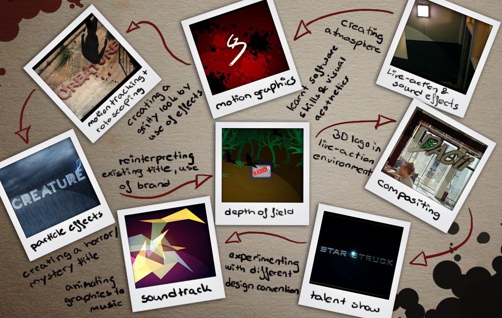
Because I focused so much on getting the final project done I have little documentation on the blog about why I have made certain design choices. The storyboards and notes should explain a fair bit but a full report on the results will be in my dissertation that will be posted here as soon as it is finished.
Once Title - US Style from Sonja Geracsek on Vimeo.
Once Title - UK Style from Sonja Geracsek on Vimeo.
Once Title - Online Style from Sonja Geracsek on Vimeo.
Storyboard
This is the development showreel of my media tests that have led up to the final project. It plays in reverse chronological order.
This image explains what I have learned from each media test and how it has moved the project forward.
Because I focused so much on getting the final project done I have little documentation on the blog about why I have made certain design choices. The storyboards and notes should explain a fair bit but a full report on the results will be in my dissertation that will be posted here as soon as it is finished.
Sunday, 15 April 2012
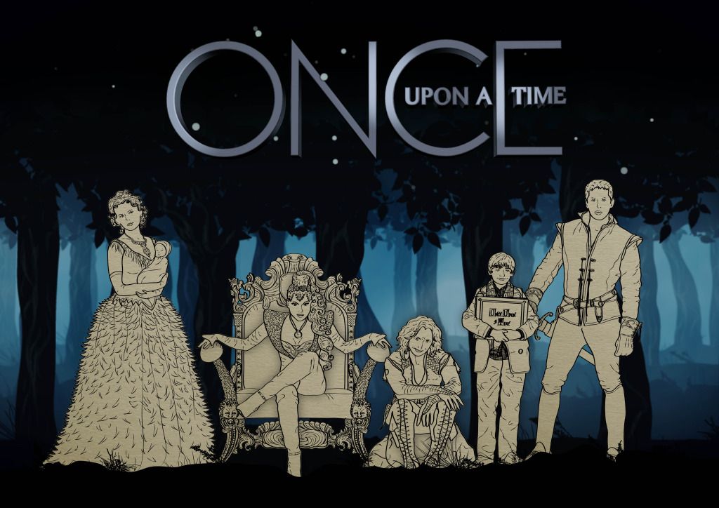
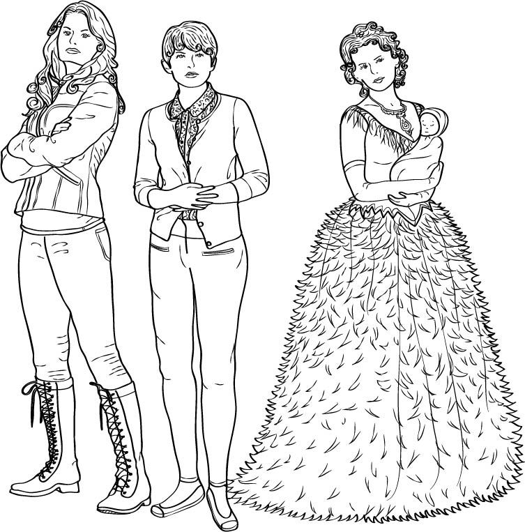
All Character Illustrations
These are the finished character illustrations, with the paper background, as if they were actually drawn on book paper.
Click on the images in the slideshow for a bigger resolution
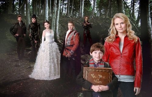
An a line-up of the main characters, in their fairy tale versions and the 3D title logo.
Click on the images in the slideshow for a bigger resolution
An a line-up of the main characters, in their fairy tale versions and the 3D title logo.
Tuesday, 10 April 2012
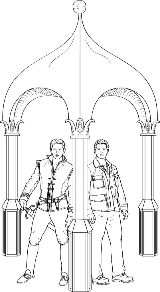
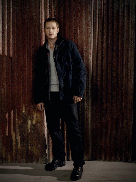
Prince/David & Arch
This is Prince Charming and his real world alter ego David. I will be switching between the versions of the characters by use of the pillar of this arch. The arch is linked to the character through part of his story arc.

click on the images to enlarge
click on the images to enlarge
Friday, 6 April 2012
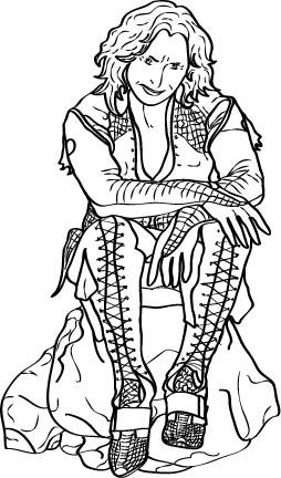
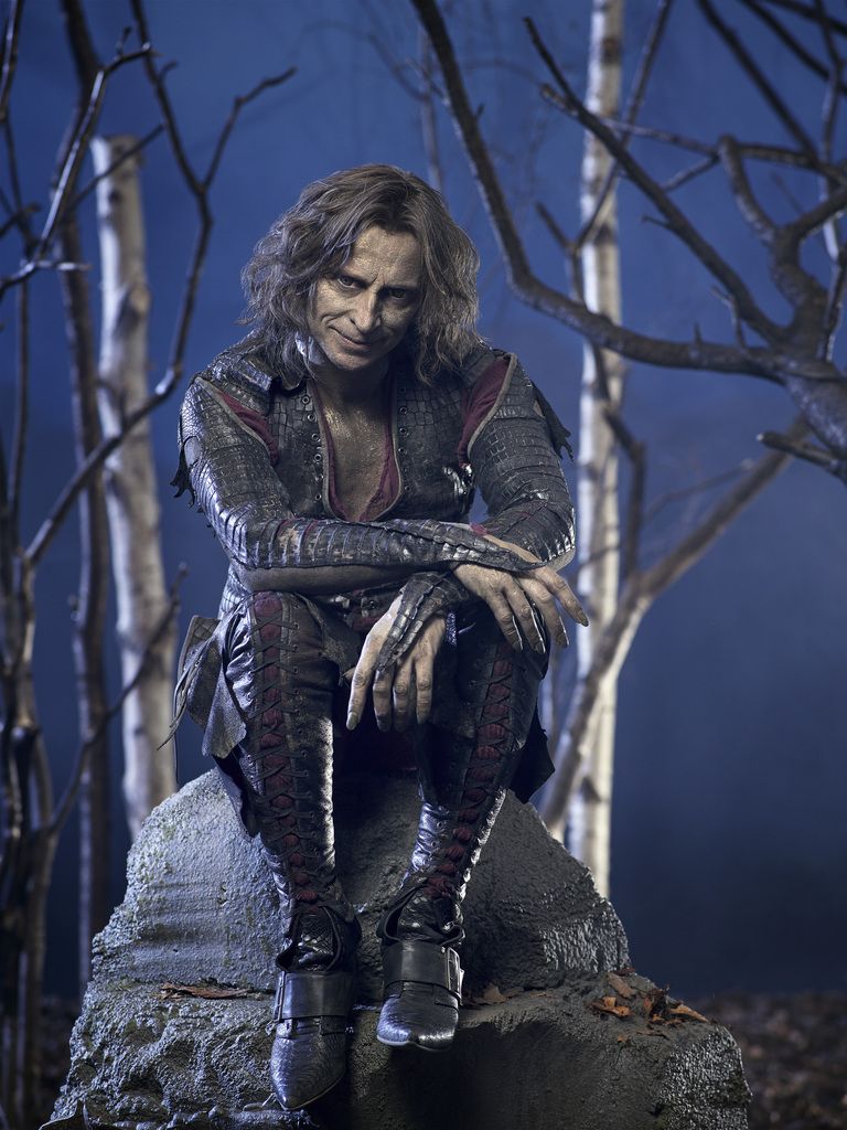
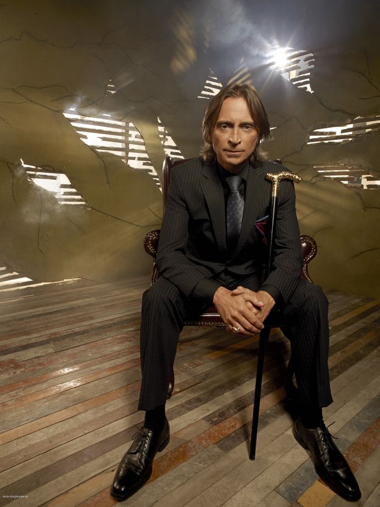
Mr.Gold/Rumpelstilskin & Rock Illustration
The object I decided to use for Rumpelstilskin is a rock. The reason for this is mainly because of positioning of the reference footage and using a different way to display the change between character version in comparison to the other characters than any symbolism links. On the other hand it could be argued that Rumpelstilskin has a heart of stone.

Wednesday, 4 April 2012
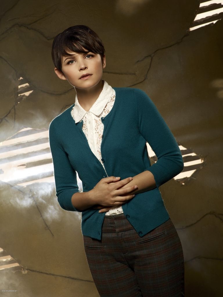
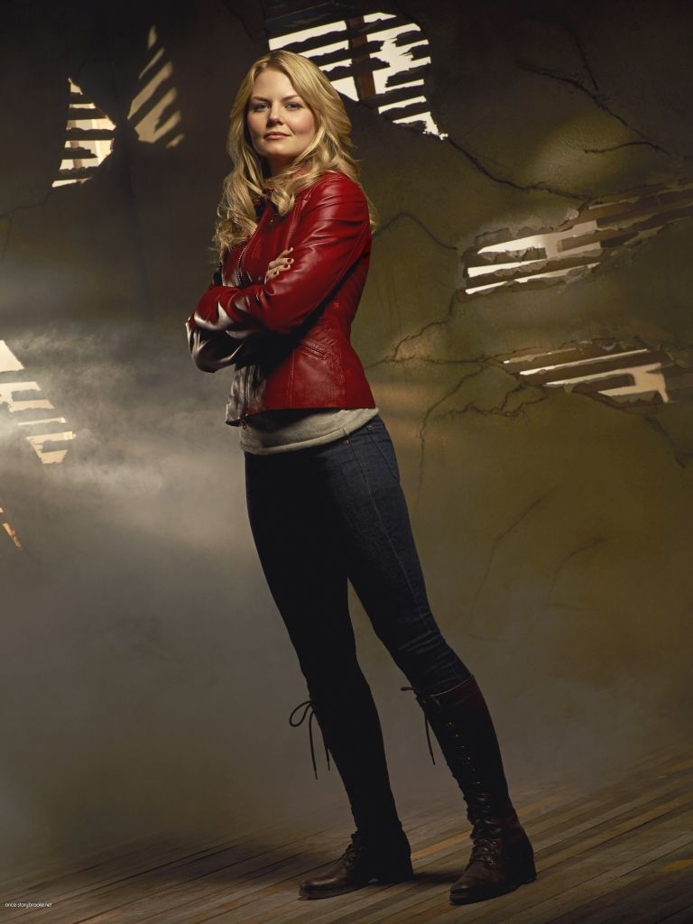
Snow White/Mary-Margaret & Emma
As Emma is supposedly Snow Whites daughter, I decided to illustrate Snow White with a baby and the two grown ups on the other side, insinuating their connection. There is no object for this pair (Snow/Mary) as the symbolic link is Emma and Snow White is seen in the woods for most of her story line. Her separation of the two character versions will be a tree in the forest environment of the sequence.
Tuesday, 3 April 2012
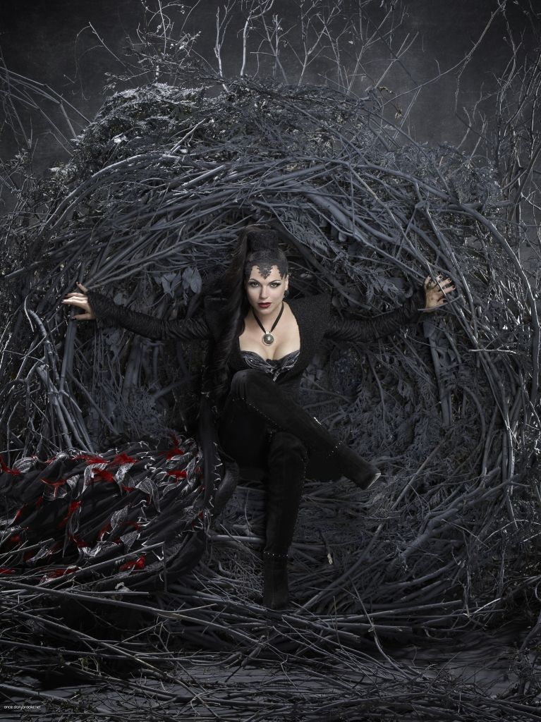
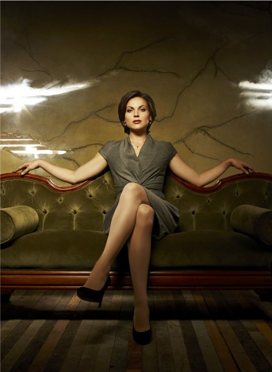
Queen/Regina & Throne Illustration
This is the Queen and her alter ego Regina. I have chosen a throne as her symbol. She occupies a reigning roll in both worlds, which is why I thought it was most appropriate. I am very proud of the throne, although I might have gone a bit crazy on the detail. Hopefully it will read well in the video. I saved it quickly, with auto-fills because I haven't created the paper backgrounds for the characters, which is why some lines disappeared or are displayed wrong but you get the picture.
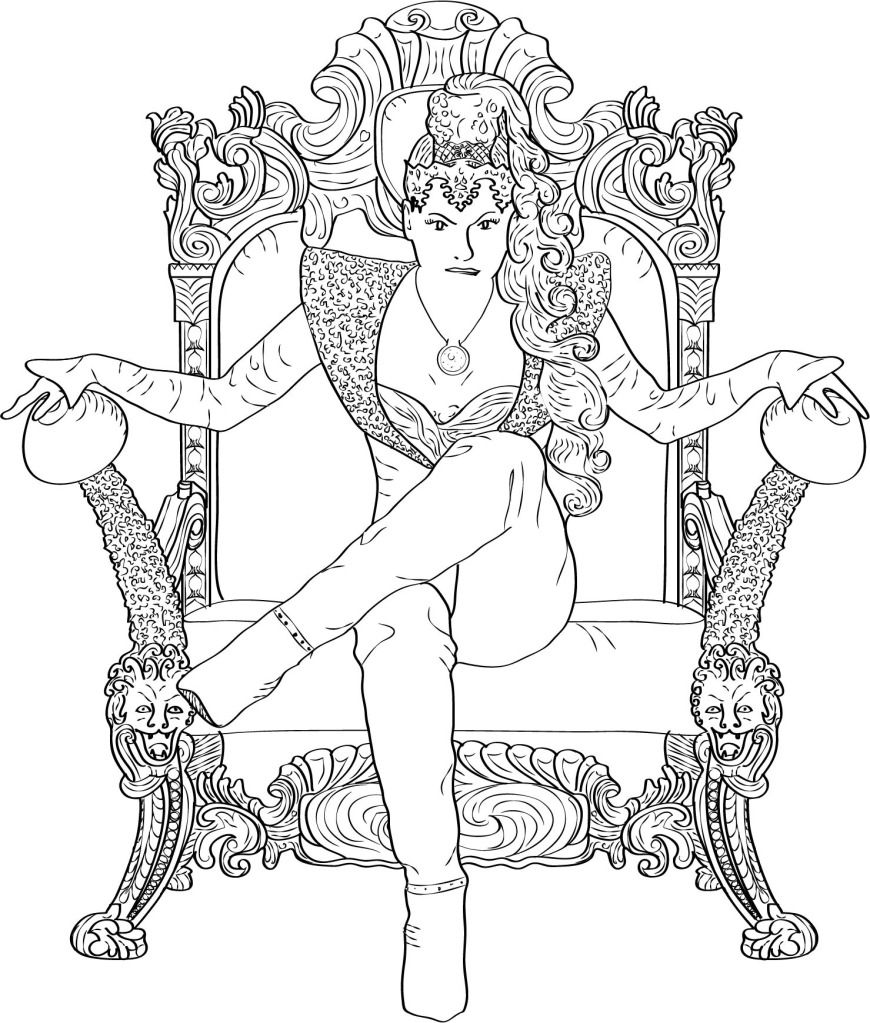
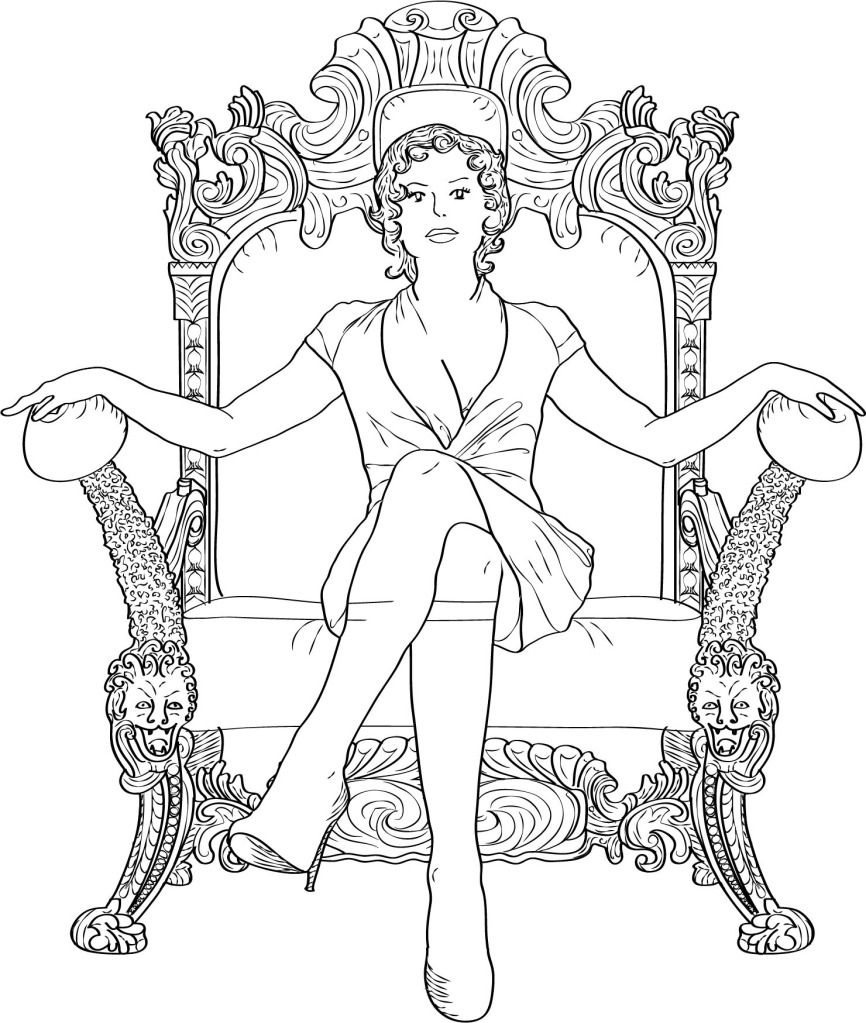
(click on the images to enlarge)
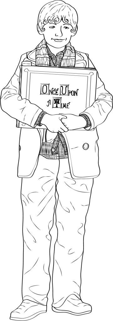
Henry Illustration
This is my illustration of the main character Henry. I have adapted his original hair style and added some locks to make it look like the fairy tale illustration style. Below is the original source footage I used to create the illustration and the slideshow of the fairy tale illustration as a comparison. The idea behind creating the illustrations is linking the title sequence back to the storybook and fairy tales which form the flip-side of the main, real life story. The fairy tales are the central part of the show (Once Upon a Time) around which all characters and stories revolve around. Each character has a fairy tale and a real life version of themselves. Which is why I am putting both versions next to each other in the title sequence to symbolise that. Henry is the only character that only exists in the real world. It is his idea that this parallel fairy tale world exists, which makes him in a way the storyteller. He is part of the story, yet detached from it, which is why he will be depicted in a different way than the other characters in the title sequence.
Thursday, 29 March 2012
Animatics and Logo
This is the animatic for the UK format title sequence I have created as a reinterpretation of the Once Upon a Time logo reveal. I have used place holders for the illustrations I will be creating for the characters. This was mainly created to show timing and the movement of the camera. I find that is still moves a bit too quickly at times that is a quick fix. The next step is to create the 3 beat version for the US, which will move a bit slower. I am a bit worried that it might be too slow but the animatic will help to identify that.
5 Beats
This is the animatic for the US format title sequence. It's much slower, only showing 3 character cards. I tweaked the transitions here a bit more than in the 5 beat animatic, which is why the timing works a bit better. That shouldn't be a reflection on the number of time cards shown. I have also created a quick mock up of the title logo but I will be creating that as 3D type for the final pieces.
3 Beats
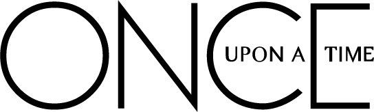
This is the vector of the title logo I created in Illustrator. I tried to get as close to the original logo as possible. I will be creating a 3D version of this and animate it in Cinema 4D for the final pieces.
5 Beats
This is the animatic for the US format title sequence. It's much slower, only showing 3 character cards. I tweaked the transitions here a bit more than in the 5 beat animatic, which is why the timing works a bit better. That shouldn't be a reflection on the number of time cards shown. I have also created a quick mock up of the title logo but I will be creating that as 3D type for the final pieces.
3 Beats
This is the vector of the title logo I created in Illustrator. I tried to get as close to the original logo as possible. I will be creating a 3D version of this and animate it in Cinema 4D for the final pieces.
Saturday, 24 March 2012
Pre-Production of Honours Project
Click on the images for a larger view
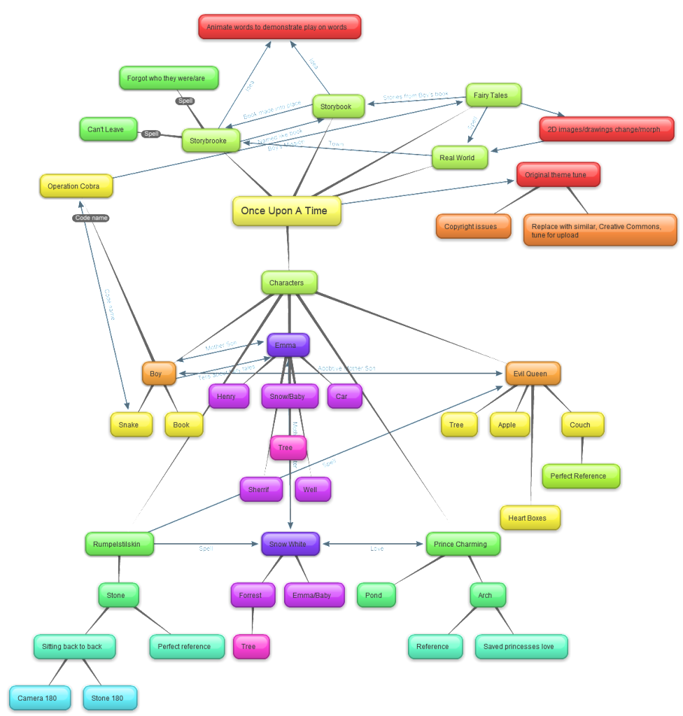
Mind Mapping Story
Brainstorming ideas
After brainstorming some ideas I came up with the final concept for the title sequence I am going to create as my final piece.
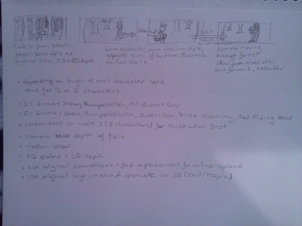
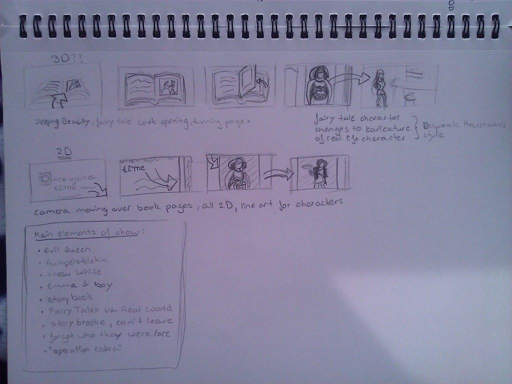
Storyboard thumbnails
Animatic
Tuesday, 20 March 2012
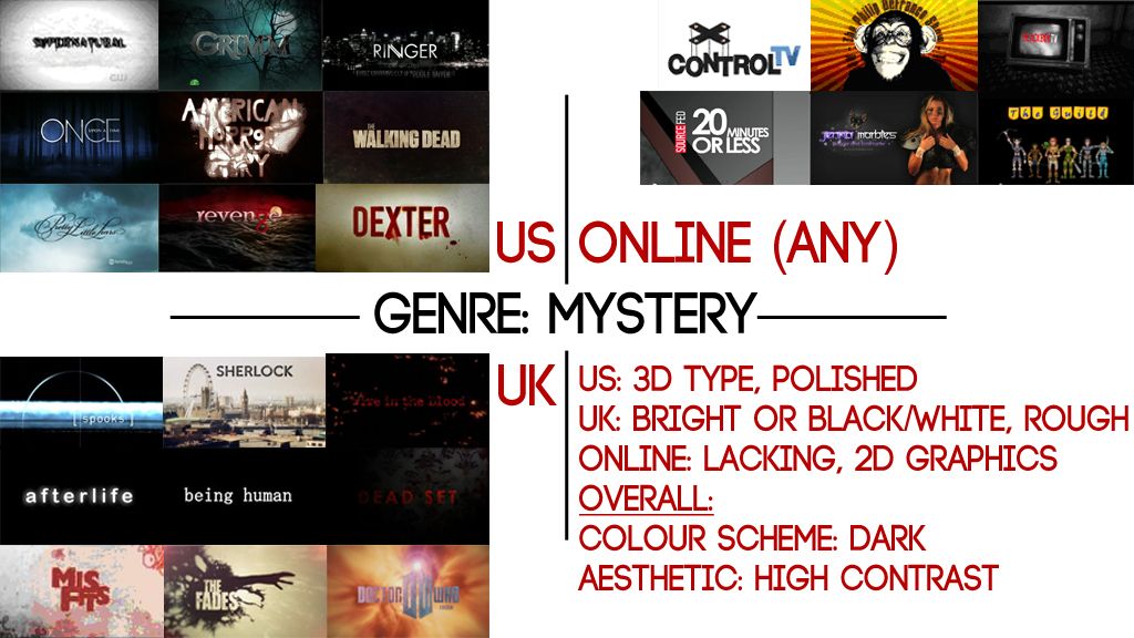
Moodboard
I have created a mood board with some notes of the things that stick out the most for all three formats within the mystery genre. I had to open up the criteria for the online format because there are not enough title sequences for that format in general and only one that I could find for the mystery/horror genre.
Friday, 16 March 2012
Collecting Criteria
I have made a mind map from the information the case studies have delivered about production values of distribution formats and the design conventions of the most common genres.
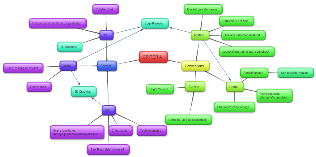
What I found out was that there are too many logo reveals, especially for the mystery genre in the US, the Saul Bass style and the youthful/hip/gritty style is overused in the UK and there are not enough striking opening titles online. Which is why I want to create title sequences for my final piece that break these moulds but are still appropriate to the production values & genre. I am not trying to create something completely new but emphasise the good designs that are present in each format rather than create another one of the overdone ones.
What I found out was that there are too many logo reveals, especially for the mystery genre in the US, the Saul Bass style and the youthful/hip/gritty style is overused in the UK and there are not enough striking opening titles online. Which is why I want to create title sequences for my final piece that break these moulds but are still appropriate to the production values & genre. I am not trying to create something completely new but emphasise the good designs that are present in each format rather than create another one of the overdone ones.
Thursday, 15 March 2012
Re-interpreting Logo Reveals
Basically what I am going to try and accomplish with my final product is something along the lines of this video, where the creator made a full length title sequence of the logo reveal of breaking bad. I am going to try and not build on the existing title of the show I will re-interpret but make a whole try a whole new approach but utilise the story in a more effective way.
Monday, 12 March 2012
Updated Learning Contract and Gantt Chart
I have updated my learning contract and gantt chart, link below:
Learning Contract
Gantt Chart
I am getting a bit worried that I am cutting it a bit close with finishing my final piece and reviewing it for my dissertation. Because my media testing has been prolonged for a month longer than I originally planned, all other tasks has been pushed further out. I hope that I will be able to finish everything in time, however I will have to talk that over with my supervisor.
Thursday, 8 March 2012
Crit Feedback
The feedback I have received for my crit presentation was to rephrase my aim slightly and replace the term "design constraints" with "design conventions". This implies that certain aesthetics are the norm but are not necessarily applied at all times. That supports my argument that within the same design convention like a certain type of genre the colour themes might be repeated across entertainment media but can still change depending on cultural differences, distribution platforms or other criteria.
Another piece of advice was not to over complicate my research. I could be researching this subject forever. It is now time to settle down and focus on my final piece. One idea mentioned was to create showreel that would be my final piece, showing my development progress and understanding of all the different visual styles and production values of title sequences, instead of having three title sequences on their own. This raises the question if that would clash with my aim, which investigates the contrast between distribution formats. The showreel might display a variety and research into several approaches but wouldn't show that contrast within defined criteria.
For that reason I have decided to pick a design convention. I will first create one title sequence for one of the formats and then adapt that title sequence to the criteria that I have identified for the other two formats. This will show how one design concept can change depending on the cultural and platform distribution based differences.
I would like to use the mystery genre and US broadcast as my gravitation point for this approach. I am frustrated with the amount of logo reveals that exist in US broadcast media for this genre. I am convinced that it doesn't always serve its purpose and the title sequence could be treated differently. From this onwards I will create adaptations for UK broadcast and online media appropriate to the production values of those two formats.
I am uncertain if picking a genre at random is the right approach but I don't see how else I can make the next step towards starting my final piece.
Next steps:
- mystery genre
- re-interpret a logo reveal of US broadcast media
- adapt design concept to criteria of UK broadcast media production values
- adapt design concept to criteria of online media production values
- potentially start LinkedIn discussion
Subscribe to:
Posts (Atom)