View Sonja Geracsek's profile on LinkedIn         View Sonja Geracsek's profile on Twitter         View Sonja Geracsek's profile on Vimeo         Watch Sonja Geracsek's Youtube Channel         Email

Showing posts with label Pre-Production. Show all posts

Tuesday, 10 January 2012

Case Study: Online Format

I am going to review and discuss title sequences from three distribution formats I have identified. These formats are episodic online media, episodic broadcast media UK and episodic broadcast media US. I will be analysing the production values and visual styles of these title sequences.

This review concerns the discussion of: Episodic Online Media Format

As it turns out online media don't fit into the same genre structure most TV shows do. The shows I have selected for review (BlackBox TV, Phillip DeFranco Show and Control TV) are not directly comparable to the TV shows of the other two formats I have selected. The first show BlackBox TV fits into the supernatural horror/thriller genre but instead of it being a continuous storyline, it is more of a selection of short films of the same theme. This allows me to review the title sequence under the same rules as the horror genre of TV shows from the other formats but it leaves to question whether online can be compared with TV at all. I was struggling to find shows that follow the same rules for story telling and therefore fit in with the same categories for immediate comparison as TV shows. The two other shows I have selected for the online format are a comedy/news show, which I realise now is not at all fitting, and a reality "TV" show. I initially chose the news show because of its motion graphics title sequence, which was the first criteria for selecting title sequences for review. However, after setting the next criteria for selecting title sequences of each major genre (comedy, drama, horror) within each distribution format, I didn't alter the online shows I was going to review. Looking over them now, I realise there isn't much I can alter as the, like I said, the ways of storytelling are not the same. There are a few online shows out there that follow the reality TV genre for example, which could fit within the drama genre - that is probably the reason why I chose Control TV (reality online show) - like Quarterlife, but don't have a compelling motion graphics title sequence. Or there are online shows that have a very interesting title sequence but are i.e. a news show like Phillip DeFranco, which is a genre I haven't touched upon in the other two formats. What I am going to do is write up a review of BlackBox TV anyway, as the horror genre is the one I want to concentrate on, and then summarise the findings of the formats I have gathered from the reviews. The online genre might have produced results under different criteria but it should nevertheless reflect the rules for or the fashion of online media title sequences.


Black Box TV by BlackBox TV


• Genre: horror/thriller
• Not succinct title sequence but to the most part the same
• The one that runs through a few episodes is floating TV behind opening door
• Black and white, moody lighting
• Setting the scene for the horror genre
• Gives a summary of the short film to be watched, similar to book back, cliffhanger
• Short, no theme music but atmospheric audio
• 3D animation
• “Title card” at the end of sequence

The BlackBox TV title sequence is in black and white, reminiscent of a 1960s horror film like Psycho. The camera enters a shabby hotel room without any furniture apart from a floating, old television box near the rear end of the room. The graphics have a smudged visual and stop-motion animation effect, while the camera is moving into the room. The audio together with the short summery of the short film to follow, stimulates a feeling of anxiety. The entire environment, with its empty space, gritty surroundings and tension filled audio fuels the suspense during the title sequence before the horror film/episode starts. Not only the black and white footage but also the abandoned hotel creates an eerie effect, possibly because it creates a link to films like the Shining which takes place in an old hotel or horror films that are situated in old, abandoned public service facilities like asylums. These are the kind of places that naturally evoke a sense of unease and one of them was therefore chosen for this particular title sequence.


• Genre: comedy news
• Very Short, amusing just like show
• Features a stylised shot of a monkey that turns into a logo, framed by the shows title
• Stylised 2D motion graphics
• Audio explains shows purpose
• established brand
• Audio and visuals instantly recognisable by audience
• Visuals aren’t linked to show content
• Title card at the end of sequence


• Genre: Reality TV comedy
• Stop motion/2D motion graphics animation
• Character displayed as puppet, metaphor for story in which he’s being manipulated by audience.
• Joystick in first shot symbolises that audience has the control over protagonist
• Short, featuring logo/title card at the end
• Title card at the end of sequence
Tuesday, 3 January 2012

Original Creature Media Test

The Creature title/trailer/intro I have been working on and of which I have posted a previous edit, you can view here, is now finished or rather at a point where I am going to conclude that particular media test. I have added some light effects for the flickering light to enhance that flickering, I have edited the sound (or had it edited by Matt West) and created a very simple animation of the kind of title logo I would have liked to create if I could spend more time on it.

Before the final version of the title I created a guide with text comments appearing throughout the video to help Matt with the sound cues. This is what it looked like:


Final Version:

Monday, 2 January 2012

Creature Lightning Media Test and Analysis


I created this title sequence based on some of the effects discussed in the VideoCopilot tutorial 97 - Lighning Strike. It's an entirely original sequence that I came up with. It's created in After Effects CS5, the sound effects are from findsounds.com and the font is from dafont.com.


I have applied the the techniques I have researched, evident in most mystery/horror show titles to my title sequence. Although I don't have a specific story for the pretend show's title, I think I have achieved a very close fit for a show of that genre. If I had a story the title sequence could have little details hinting at the show, which would give it more depth. Like the Grimm Title Sequence:

I believe I am at a stage where I understand the motion graphics production values for the mystery/horror genre. I am yet to filter out the differences in production value between distribution formats for that genre, but I think I am getting close. It's time to start thinking about a story for the pretend show I will be making the title for.

Monday, 19 December 2011

Media Test Pro Guide: Titles

I was following a tutorial from the Computer Arts Pro Software skills DVD.


This is the work in progress version.


This is the finished version with some added changes and final touches.

Friday, 16 December 2011

Case Study: UK Broadcast (Adapted Choices)

I am going to review and discuss title sequences from three distribution formats I have identified. These formats are episodic online media, episodic broadcast media UK and episodic broadcast media US. I will be analysing the production values and visual styles of these title sequences.

This review concerns the discussion of: UK Episodic Broadcast Media Format


  • Genre: Supernatural mystery/drama
  • Motion graphics & 2D Animation
  • Similar style to mad men, rough, scratched paper style but more gritty
  • The only live-action are characters composited into 2D set
  • Recap of storyline, how characters got there and what their powers are
  • Catchy theme tune
  • Lots of secrets, reflected in TS
  • Hints to what is going on but not clearly displayed
  • Shaky camera and slight moving in and out, trend (skins, fresh meat)
  • Suggests young and edgy style, “real”
  • Title card in the middle of sequence

The Misfits title sequence starts off with the very foundation of the story. It depicts the storm in which all protagonists received superpowers. It proceeds to reiterate the subsequent occurrences in a brief summary, hinting at the characters’ powers but not reveling them completely as this is the main subject of interest in the first season. The grey colour scheme and rough appearance of the animation is reflective of the scenery and prepares the audience for the dull, repressive environment the characters live in. The up-beat soundtrack acts as a contrast and communicates a young, vibrant atmosphere that promises excitement. The introduction of live-action shots of the characters suggest they play a vital part to the story. This reveals a dramatic element of the show which is mostly seen in the drama genre and as such elevates the story to be more than just supernatural and thrilling but also emotional with a focus on relations between the characters.
The motion graphics animation helps to conceal the many secrets that are about to be uncovered throughout the show. If live-action footage had been used for this title sequence it would have most likely been scenes from the show itself and as such exposed parts of storyline to the audience they should not at that point have seen.
The title card appears in the middle of the sequence, which is unusual as most title sequences display the name of the show at the end of the sequence. The reason for this might be that although the characters are misfits to the world around them, serving the community for their previous unlawful activities, that is not what the show revolves around. The main focus is on the superpowers they have gained and what implications they carry. In this context they in fact “fit” in with most of the supporting characters of their world.
The length of the sequence is similarly unusual for the mystery genre. Even though the sequence is not sharing all information with the audience it is telling a large amount of the story, or rather recapturing the highlights of the story. Simultaneously the sequence is giving hints of the story in such a way that the imagery becomes a mystery itself. By symbolising the characters’ powers in such abstract graphics they pose as riddles rather than clues.
The slightly shaky camera and colour flashes are representation of the production value of the show, the rough storyline as well as overall visual style. It is also a very common trend of a young and edgy show for this kind of target audience and genre as seen in shows of the same demographic like Skins or within the same genre like Supernatural.


  • Spy - created for Sky One from Liquid TV
  • Comedy
  • Motion Graphics only
  • Saul Bass Homage
  • reflective of story - spy elements and gadgets interwoven with credits
  • funny, reflecting genre
  • captures main characters and their personalities
  • Title Card at the end of sequence


Merlin by [unspecified]


  • fantasy drama
  • season 4
  • motion graphics and live-action
  • motion graphics serves the purpose of conveying the magic in the show
  • colour scheme is of old parchment or gold, reminiscent of the middle ages
  • mystical creatures, scenes of battles and main characters and other elements of a fantasy world reflect the story, genre and time
  • evokes excitement, through sparks, explosions and action scenes
  • it shows how tough and dangerous but also how exciting the story is
  • ever changing live-action footage keeps the show up to date with the change of actors and story line, typical for a drama show
  • dramatic ending with the title typeface in flames
  • title card at the end of the sequence

Thursday, 15 December 2011

UK Broadcast Title Sequences

As it turns out, The Fades, which was one of my picks as a replacement for the other two title sequences for review of the UK broadcast distribution format is for 1) a Supernatural Horror - this would replace Misfits, which I wanted to keep - and 2) it was made by the same production company that produced Misfits and Fresh Meat. It seems that Momoco is getting a lot of work on title sequences in the UK and are leaving their style mark. Their sequences are different for each show but have definitely a creative stamp on them.

Spy, produced for Sky 1, could replace Fresh Meat for the review of a comedy show and Merlin would take the place of (fantasy) drama. I was struggling to find a drama that had motion graphics title sequences. I looked at Downton Abbey as it's a period drama just like Mad Men, but it has a full live-action title sequence with simple credits.

Any of the other Shows previously suggested for review are unsuitable after watching the title sequences.


Campus (Youtube - TV shows) by Monicker Pictures

Outnumbered (Hat Trick Website) by Hat Trick Productions and Halo Post Production

Wednesday, 14 December 2011

Show Treatment

After a conversation with Lynn (Parker) it became clear to me that in order for the media tests to serve their purpose I have to have a goal in mind. So far I have been experimenting with Logo designs and title sequence designs in general to test the knowledge I gathered from literature and watching popular tv/online show title sequences without aiming for a specific story. It was mainly to test my boundaries, get to know After Effects and to see how close I could get to any given style I picked but as Kyle Cooper has taught me already a title sequence should be driven by the content. Which is why I have to write a treatment for a pretend show to be able to test title sequences for it and make the media test stage more productive. As proposed in my presentation I will be choosing a Genre, which is usually linked to a certain target audience and visual style and will write a story synopsis and treatment for the show/pilot episode and apply this to the production of three title sequences, one for each distribution format (US, UK, online), with appropriate changes in production value for each format.

This way I will ensure that I am able to produce three title sequences without having to create three shows, each with a separate title sequence. Apart from the alternate option being impossible for the timescale, it would also not showcase a direct comparison of production values and visual styles between formats as the story, ergo the visual style, would be different for each format.

I am aiming to produce a treatment for the end of January, which is when I plan on starting the production process.

Saturday, 10 December 2011

Case Study: UK Broadcast (Original Choices)

I am going to review and discuss title sequences from three distribution formats I have identified. These formats are episodic online media, episodic broadcast media UK and episodic broadcast media US. I will be analysing the production values and visual styles of these title sequences.


This review concerns the discussion of: UK Episodic Broadcast Media Format

I was originally going to discuss these three shows but realised that they have all been created for the same network (Channel 4/E4) and have very similar production values applied to them and therefore a very similar visual styles, even though each one is for a different genre/theme. I will stick with the discussion of Misfits, as it fits into my selection of the Supernatural Thriller/Drama Genre I have chosen for my title sequence production. I will replace the remaining two with shows from different networks with a similar theme to those I had picked originally in order to compare and contrast formats and values sufficiently.

A few shows I have already identified include The Fades (BBC 3), The Office (BBC2?), Spy (Sky 1), Outnumbered, Campus. I will view the title sequences for these shows and pick appropriate ones for this review and repost the results.


MISFITS from MOMOCO Film Titles on Vimeo.


Misfits by MOMOCO Film Titles & Maguffin

• Genre: Supernatural mystery/drama
• Motion graphics & 2D Animation
• Similar style to mad men, rough, scratched paper style but more gritty
• The only live-action are characters composited into 2D set
• Recap of storyline, how characters got there and what their powers are
• Catchy theme tune
• Lots of secrets, reflected in TS
• Hints to what is going on but not clearly displayed
• Shaky camera and slight moving in and out, trend (skins, fresh meat)
• Suggests young and edgy style, “real”
• Title card in the middle of sequence


FRESH MEAT from MOMOCO Film Titles on Vimeo.


Fresh Meat by MOMOCO Film Titles

• Genre: Comdey
• Motion graphics compositing on live-action footage of location
• Young, edgy, story reflects target audience (students)
• TS reflects story
• Small depth of field, edges and background blurred. Similar to show footage of Misfits
• Shaky camera, trend
• Musical theme tune
• Footage of location reflects messy life of a student and the sometimes “messy”, unlinked storytelling style
• Title card at the end of sequence


Skins by BBC Studios and Post Production

• Genre: Drama with comedy elements
• Gritty, young, daring storytelling reflected in TS
• Live-action footage integrated into motion graphics animation
• Sex, drugs and rock’n’roll attitude and story elements recycled in TS footage
• Colourful, reflecting carelessness, youth
• Musical tune
• Ends on show title
• Use of live-action footage of peer group and individual characters consistent with trend of drama genre

Friday, 18 November 2011

Showreel (test) and Analysis

I've created a short showreel (test) with the projects I would like to include in my future, polished showreel. I used the ink drop and the logo indent media tests that I have created previously. The music is a creative commons licensed song.


The work included in this reel are: E4 Esting, FilmG "True Colours" Kiss Scene, 3D Models showcased in Watertown showreel

The main challenge of this media test was to match the clips up with the beats in the song and create a flow that would showcase enough of each project but not be boring through shots that are too long. The typeface of the contact details in the end could be better. It looks a bit stuck on, which it is and instead of just cutting from one clip to the next, there could be some nice transitions that would show off my motion graphics skills. I'd also like to include more work and a breakdown, explaining what I did in each project.

Ink Drop and Analysis


I created this little animation as part of my media tests, following the same tutorial on Video Copilot as the one where I created the splatter indent. It helped me to familiarise myself with the use of light, effects and layers in After Effects and creating an animation with static images. I still feel that there is much to learn and will therefore continue to create tutorial-led media tests before I can create an original piece.

Thursday, 17 November 2011

Logo Design and Analysis

I tried designing a "freelancer logo" for myself. By doing this I am hoping to understand logo and subsequently title design for future productions. I took advice from a tutorial on the Computer Arts website here. This is what I came up with before I gave up, because it wasn't going well:


It kind of looks like a sports logo, Adidas or something. I thought the soft typeface would work with the pseudonym I gave myself. "Geracs" for the first 6 letters of my last name and "So" for the first two of my first name - this used to be my high school PC account name, which I have adapted as a profile name for various platforms (as seen in my blog URL ;) ) - but together with the colours and the swerved underline, it looks very much like a sports logo and not much like a logo for a freelance VFX artist.

I had a look at portfolio pages and logo designs of post-production supervisors and VFX artists on LinkedIn but I couldn't see a "trend" as the tutorial was suggesting to do. I think I have to follow more tutorials on logo design and typography to get a hang of this, before I create a unique design for my project.

Wednesday, 16 November 2011

Case Study: US Broadcast

I am going to review and discuss title sequences from three distribution formats I have identified. These formats are episodic online media, episodic broadcast media UK and episodic broadcast media US. I will be analysing the production values and visual styles of these title sequences.


This review concerns the discussion of: US Episodic Broadcast Media Format 


  • Genre: mystery thriller/drama
  • Motion graphics animation
  • Short
  • Changing throughout seasons but keeping within brand
  • Showing little of storyline
  • Creating atmosphere through visuals and audio
  • Hint to/reminder of main storyline
  • Jitter of title and visual style are consistent with trend of horror genre
  • Title card, main graphic of sequence

The Supernatural title sequence is created with the shows mystery/thriller genre in mind. The title emits mystery by not giving away details, instead only showing the mere gist of the current season. Supernatural has retained its style throughout all 7 seasons with the name of the show in the centre of the screen and season related motion graphic animations alongside it. It has never been more than a logo come animated indent. The most recent title starts off with a black splatter that spreads towards the screen in slow motion before it is rapidly sucked into the “Supernatural” lettering. The show title is displayed in black on a white background with the black fluid moulding itself around the lettering before said, jumping back and forth a few times, moves towards the screen in a quick motion. The brevity of the title cleverly conceals the details of the story but revels enough of the main storyline through hints in the visual style. The black substance, referring to the main enemy of the current season, creates a reminder of the golden thread that runs through the entire season despite the story diverting to a separate issue for almost each episode, occasionally loosing sight of said thread. Creating a title sequence solely with motion graphics without the use of live-action footage seems a deliberate choice in order to compose an atmosphere appropriate to the theme. It evokes mystery through emission of detail not only of the story but also about the villain the shows’ heroes have to face for the current season. From the first viewing the audience does not know if this villain is man or monster and that the black substance in fact relates to it. With this, the title orchestrates intrigue that reels the viewer in and acts as a reminder from there on out thus playing into the hands of the genre. Live action footage might spoil this intrigue and not have the same, mysterious effect.
The mystery genre is reflected in the title sequence visually as well as aurally. The sound is reminiscent of a creature that you might encounter in such a world of supernatural beings. The jitter of the lettering towards the end of the title is very typical of the mystery/horror genre as seen in films such as Paranormal Activity and prepares the audience for the kind of experience they are about to encounter. Despite the ever changing visual style of each seasons title, the animation and “Supernatural” type face as well as the audio has remained similar if not the same creating a recognisable brand. Short, animated sequences of this style have become a trend since Lost and are a continued technique used for secret bearing, mystery themed shows as Breaking Bad and Ringer.


  • Period drama
  • Motion graphics & 2D Animation
  • Saul bass 60s style
  • TS is story of Don Draper, man losing his footing in the changing ad business and changing times
  • Possibly deferrable onto any male character in show – faceless man makes it possible
  • Style detached from realism, just like the advertising business
  • TS underpins some themes and storylines of show
  • Title card at the end of sequence


Big Bang Theory by The Picture Mill

  • Comedy drama
  • Science orientated, reflected in title sequence
  • TS is fast forward of evolution and human invention in still frames
  • Some 3D elements at the start
  • End on a main cast live action frame, similar to comedy drama shows like friends
  • Tying together the genre, through comedic soundtrack and visuals, subject of discussion (science) and relationship/friendship story references through last shot
  • Title card at the end of sequence

Gantt Chart & Project Proposal

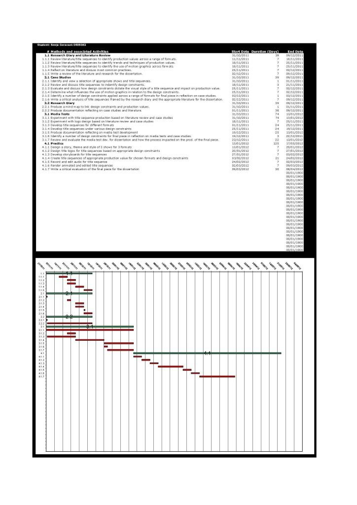
Here is an edit and updated project proposal and gantt chart. The proposal is still not finished, the abstract needs shortening and the rationale is not written yet. I also need to send it for review as I'm not sure if this is what it's supposed to look like. I have edited the gantt chart to allow more time for media tests. Although it looks like I'm doing an awful lot in the first semester, it actually has to be that way as I am doing some of the task at the same time or intermittently. which means they have to run parallel to each other. I have still got enough time for producing the final piece in semester 2 and write my dissertation, so I'm quite happy with the time I have scheduled for my tasks.

Gantt Chart PDF

Project Proposal PDF

Thursday, 10 November 2011

Gantt Chart

Gantt Chart PDF

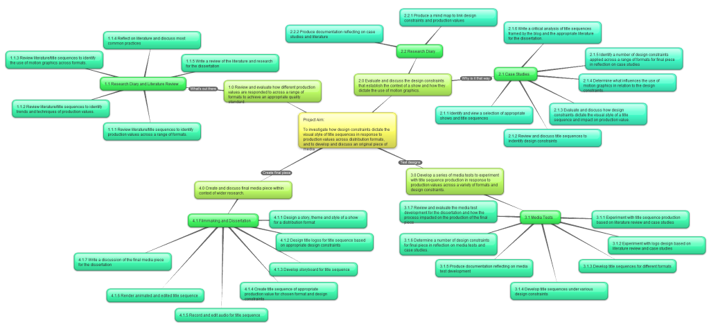
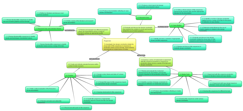
(6.1) Aim, Objectives, Methods, Tasks and Deliverables

Aim and Objectives:

The aim of this project is to investigate how design constraints dictate the visual style of title sequences in response to production values across formats, and to develop and evaluate an original piece of media.

The objectives are as follows:

  1. Review and evaluate how different production values are responded to across a range of formats to achieve an appropriate quality standard.  
  2. Evaluate and discuss the design constraints that establish the context of a show and how they dictate the use of motion graphics. 
  3. Develop a series of media tests to experiment with title sequence production in response to production values across a variety of formats and design constraints. 
  4. Create and critically evaluate final piece within context of wider research.

Methods and Tasks:

click to enlarge

Deliverables:

1.1 Research Diary and Literature Review
  • Digital Diary/Blog documenting research activities undertaken and reviews written for Objective 1.0 

2.1 Case Studies
  • Deconstruction, identification and discussion of cases 

2.2 Research Diary
  • Digital Diary/Blog documenting discussion of research 

3.1 Media Tests
  • Logo Designs 
  • Indents 
  • Title sequence experiments in After Effects 
  • Video files of all media tests 
  • Documentation detailing the content and reflection on practice for each of the media tests and animations 

4.1 Practice
  • Show briefs for 3 formats 
  • Storyboards for title sequences 
  • Title Designs 
  • After Effects files 
  • Audio 
  • Final render of title sequences 
  • Documentation of critical evaluation and reflection on practice within context of research

Tuesday, 8 November 2011

Crit Presentation

"The TV title sequence is a branding endeavor and a legitimate art form. It is the sole, consistent, and iconic moment that carries through a show’s lifespan and beyond. It’s what you remember most."
~ Digital Kitchen

Recap

Research

Mind Map

Aim and Objectives

Project Map (Methods and Tasks)


Glossary:

Production Value - "how is it put together"
  • combined technical qualities of the methods, materials and stagecraft skills used in the production of a film, video or live performance (lighting, sound, scenery, props)
Design Constraints - "why is it put together that way"
  • limitations within which a production is designed under (theme/genre, target audience, story)
Format - "where is it going to be seen"
  • a plan for the organisation and arrangement of a specific production, general appearance


Honours Project:
  • Produce Title Sequence
  • Motion Graphics Design
  • 1 Genre, 1 Target Audience, 3 Formats
    • Supernatural Thriller/Drama
    • 16-34
    • Online, Broadcast UK, Broadcast US
      • Black Box TV, Misfits, Supernatural


Media Tests:

Trailer/Title Sequence/Intro:


Title Design:


Production Company Indent:


Crit Week Supervision

At this weeks crit the students showed a lot of progress, which I tried to get across to them as much as possible because I know how often people giving feedback forget to do that and only critique things that need improvement.

I did notice however that my appeal to them last pitch of keeping a blog did not catch on. Only one person actually had a blog, but this was only filled with development for one module. One other person mentioned she was going to post everything on the blog after she had finished all her sketches and concepts. This is again not the way to go, I think. Personally, I think a blog is a great thing and very important to keep your thoughts in one place but as I tried to make that clear to the students last pitch I didn't make a point of saying it again.

Especially as this time there was something else lacking and that was preparation. A lot of the students had done great work and had lots to show (in their sketchbooks) but some had either forgotten to make a note of their ideas, or had more in another sketchbook they had forgotten and so on. I felt the need to remind them that this was the time to ask for feedback, to learn from other students and fourth years and gain invaluable perspective they would otherwise not be able to receive. Yes it's annoying if the person who's holding a presentation isn't well prepared but in this case they should be more fussed about getting feedback than us getting a nice presentation. It's a shame they're not aware of that enough, so I tried and make them understand that pitch and crit is mainly for them to learn and less about us saying "well done, good presentation".

It also seemed that a few of the students spent quite some time researching and making concepts, instead of diving into the development stage. Me and Dmitrijs made sure that they are aware of the time frame and that they should start developing their ideas instead of doing more research.

All in all, I think I gave good feedback, made the students aware of what's important and what to look out for. I also mentioned that you don't have to start a new project for every module and every year but (depending on the lecturer and the module) you can use concept work from one semester to develop the project further in the next or use a 3D model for another project. That's what I did for a few of my projects over the years and it worked out really well. That way you don't end up with a lot of scattered ideas but a few solid portfolio pieces, that were developed over more than just one semester

Indent - Media Test (3) and Analysis


This is my first motion graphics only animation, I created after viewing two separate After Effects tutorials on Video Copilot (mentioned in an earlier post). It has an eerie atmosphere, created by the black and red colour scheme and the splatter effects. Combined with the dark red colour, it makes the splatter look like blood. It wasn't intentional but I suppose by looking into the horror genre and creating my 2nd media test "creature" I was already in the "horror zone". I realise, however, that it doesn't have that subtlety a sequence of this theme should have. It is too forward, too bold with the colours and patterns. Although it isn't a title sequence for a show intro it still emits a certain vibe but it's doing so in a very forward fashion, which isn't customary for this type of theme. Realising this I have to go back to my research and analyse genres/themes and their visual styles and production values and I want to do that across the three formats that I have already identified for my project: online, broadcast UK and broadcast US.

I am using two broadcast types because these two countries are outstanding for high end TV productions. The US is without a doubt the number one producer of world class TV and the UK has a distinctly different style but is not far off from being as big as the US for its productions. This is why I want to analyse these two formats separately and against each other and also compare and contrast them against online productions as that is becoming increasingly popular for media consumption as outlined in my Digital Media Practice Essay.

Monday, 7 November 2011

6th Aim and Objectives

Project Aim:

To investigate how design constraints dictate the visual style of title sequences in response to production values across formats.


  1. Review and evaluate how different production values are responded to across a range of formats to achieve an appropriate quality standard.
  2. Evaluate and discuss the design contraints that establish a context of a show and how they dictate the use of motion graphics.
  3. Develop a series of media tests to experiment with title sequence production in response to production values across a variety of formats and design constraints.
  4. Create and critically evaluate final piece within context of wider research.
click to enlarge